ArchiMate - Diagram Layout Techniques
This article is part of the The ArchiMate Series
Nesting Interface Elements
Gerben Wierda's excellent book; Mastering ArchiMate (I have edition 2), has a chapter on aesthetics which covers various techniques you can use to improve the readability of your ArchiMate diagrams.
There is also a section in the book on Nesting, which highlights the issues of using nested elements and how this can result in ambiguity. There are several relationship types which can be represented by placing one element inside another but is it not always obvious to the reader which relationship type was intended.
So, nesting ArchiMate elements must be done with some caution. Here is a nested element technique which can be used to reduce the visual clutter and size of diagrams while preserving the original intent.
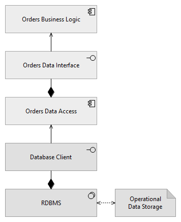
Fig 1. shows an technology interface component called "Database Client" and an application interface called "Orders Data Interface". This simple example has five elements stacked vertically which is a lot of elements to represent three layers; business logic, data access and data storage. We could simplify the diagram by removing the interface elements but then we would have to add additional relationships between the components.

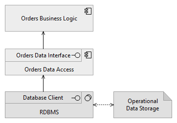
Fig 2. has the same elements in a more condensed layout. The height of the interface elements have been reduced and they have been nested inside their parent element. The names of the parent elements have also been aligned to the bottom. This diagram has the same information as Fig 1. but it is much easier to read.

Further Reading
- Mastering ArchiMate - from Gerben Wierda