ArchiMate - Muted Colour Scheme
This article is part of the The ArchiMate Series
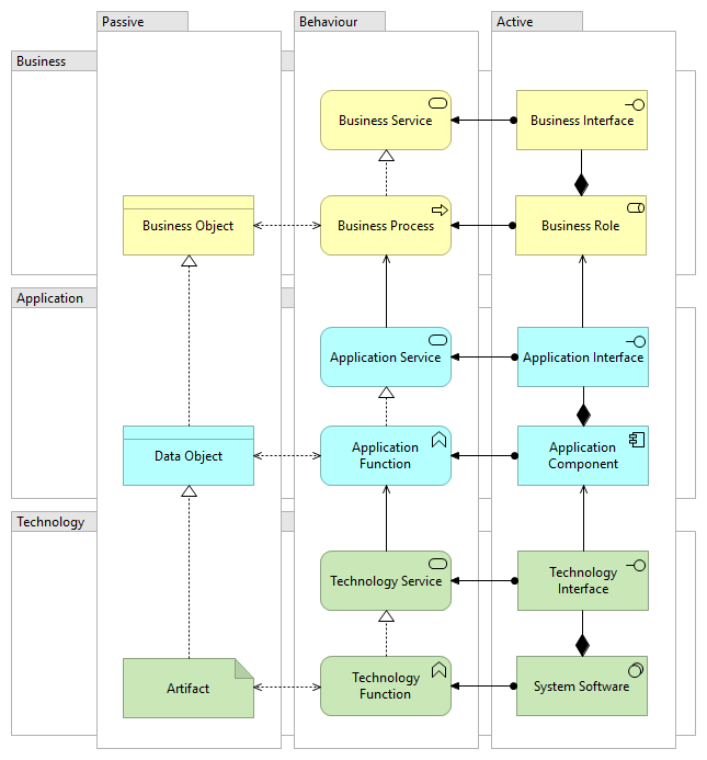
The ArchiMate specification is colour-neutral although some common colour schemes are in use, e.g. yellow, blue and green being used for either the core layers or core aspects. This colour scheme ain't the prettiest in my opinion and it doesn't fit in very well with the colour palettes used by most companies. While not the prettiest, it is functional and does allow a reader to easily distinguish between elements across the various layers and aspects.
Fig 1. shows a subset of the elements from the core metamodel with a common colour scheme:

When creating a detailed model in ArchiMate we generally use elements from several layers in one view. Since these views have several layers they can be quite colourful and visually busy. I wouldn't normally share these views with stakeholders as they contain too much detail and would cause confusion.
Breaking the model down into smaller view makes it easier to digest, e.g. a view representing the steps in a business process, a view representing the application and another view showing how the high level elements of the business process are served by the application services. Similarly, a view for the technology layer and another showing the application components allocated to nodes. These views are much easier for stakeholders to read and understand.
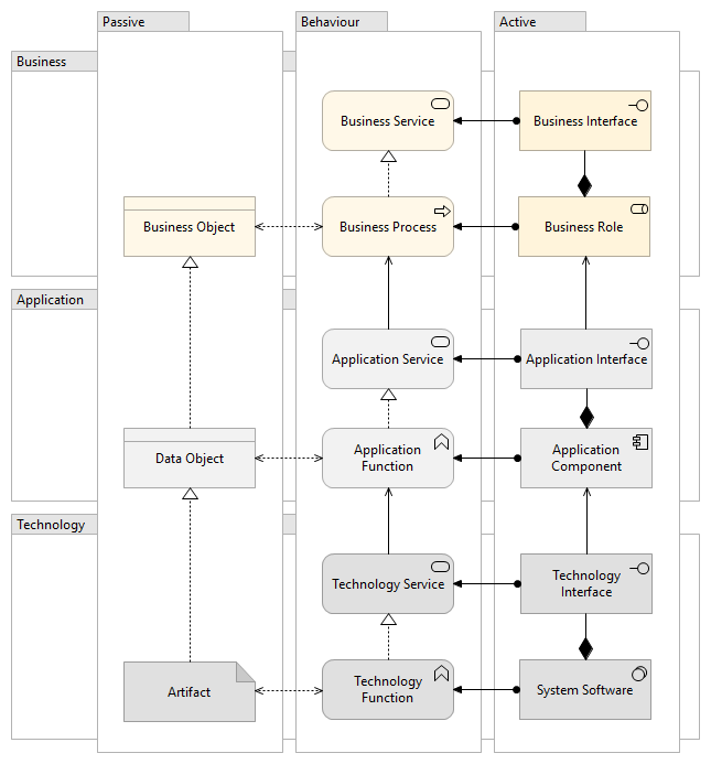
The Muted Colour Scheme
Fig 2. shows a subset of the elements from the core metamodel with a muted colour scheme, this reduces the visual noise in the views:

Stakeholder Views
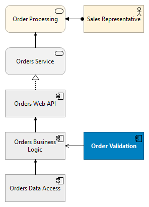
When creating a view to share with stakeholders, start by selecting the elements being discussed in the documentation or presentation, e.g. a future state where new business process steps or application components are being introduced, this should be a relatively small set. Then add some additional related elements for context. To improve readability, highlight the main elements being discussed by setting the fill colour to the primary colour from your corporate branding guidelines, set the font weight to bold and the font colour to a contrasting colour i.e. white.
These diagrams fit in quite nicely when used with corporate document or presentation templates. Fig 3. shows a simple example where the Order Validation component is highlighted:

Download
This colour scheme is available as a prefs file for Archi:
In Archi, navigate to Edit/Preferences/Colours and Fonts and click on "Import Scheme..."
Further Reading
- 9-Colour Scheme for Archi - from Gerben Wierda
- Mastering ArchiMate alternate colour scheme with Archimate 3